Benjamin Moore Color of the Year: 7 Years of Colors Reviewed
7 Years of Benjamin Moore Color of the Year: Which Ones Still Work Today?
Benjamin Moore’s 2027 Color of the Year reveal is just days away, and if you know us, you know we love this time of year.
Every fall, the major paint companies start rolling out the colors they believe are about to shape home design. Some become instant favorites. Some take a little convincing. And some make us wonder, Who is actually going to paint their house that color?
But the really interesting question comes a few years later:
Did the color actually have staying power?
Was it simply perfect for that particular design moment, or would we still recommend putting it on your walls today?
While we wait to see what Benjamin Moore chooses for 2027, we decided to look back at their last seven Colors of the Year—from 2020 through 2026—and give you our take.
And yes, we definitely have favorites.
2026: Silhouette AF-655
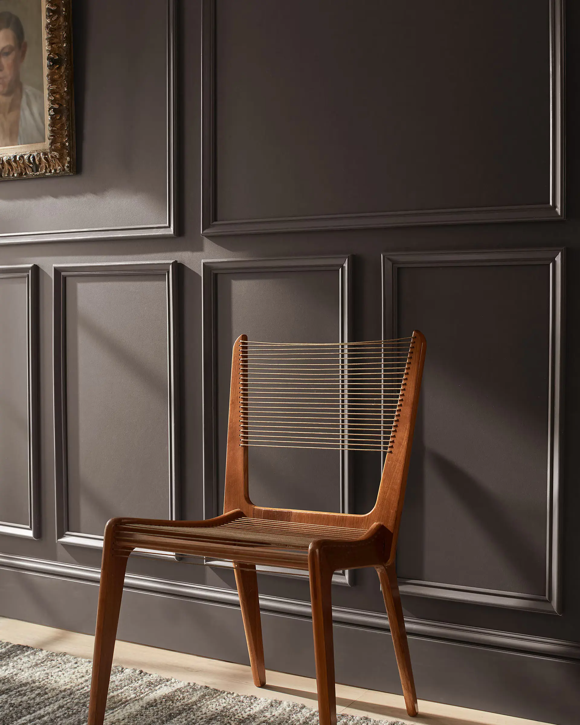
Benjamin Moore describes Silhouette as a combination of rich espresso with charcoal undertones, and that pretty much sums up why this color works. It is extremely dark, but it doesn't feel like a flat black. There's warmth and complexity underneath it.
Do we still like it?
Absolutely.
Of course, Silhouette is also the current Color of the Year, so we haven't exactly had enough time to see whether it will become a true classic. But dark chocolate browns, espresso tones and warm charcoals are still having a major moment.
Would we paint an entire open-concept home in Silhouette? Probably not.
But give us a dining room with beautiful wall moulding? Yes.
A color-drenched powder room? Absolutely.
A moody office, library or primary bedroom? Even better.
This is one of those colors that gets significantly better when it's used intentionally. Paint the walls, trim and moulding together and suddenly the architecture of the room becomes the star.
Our verdict: Still trending, but we think it has enough classic brown and charcoal underneath it to stick around long after the trend moves on.
2025: Cinnamon Slate 2113-40
Full disclosure: this one is a personal favorite.
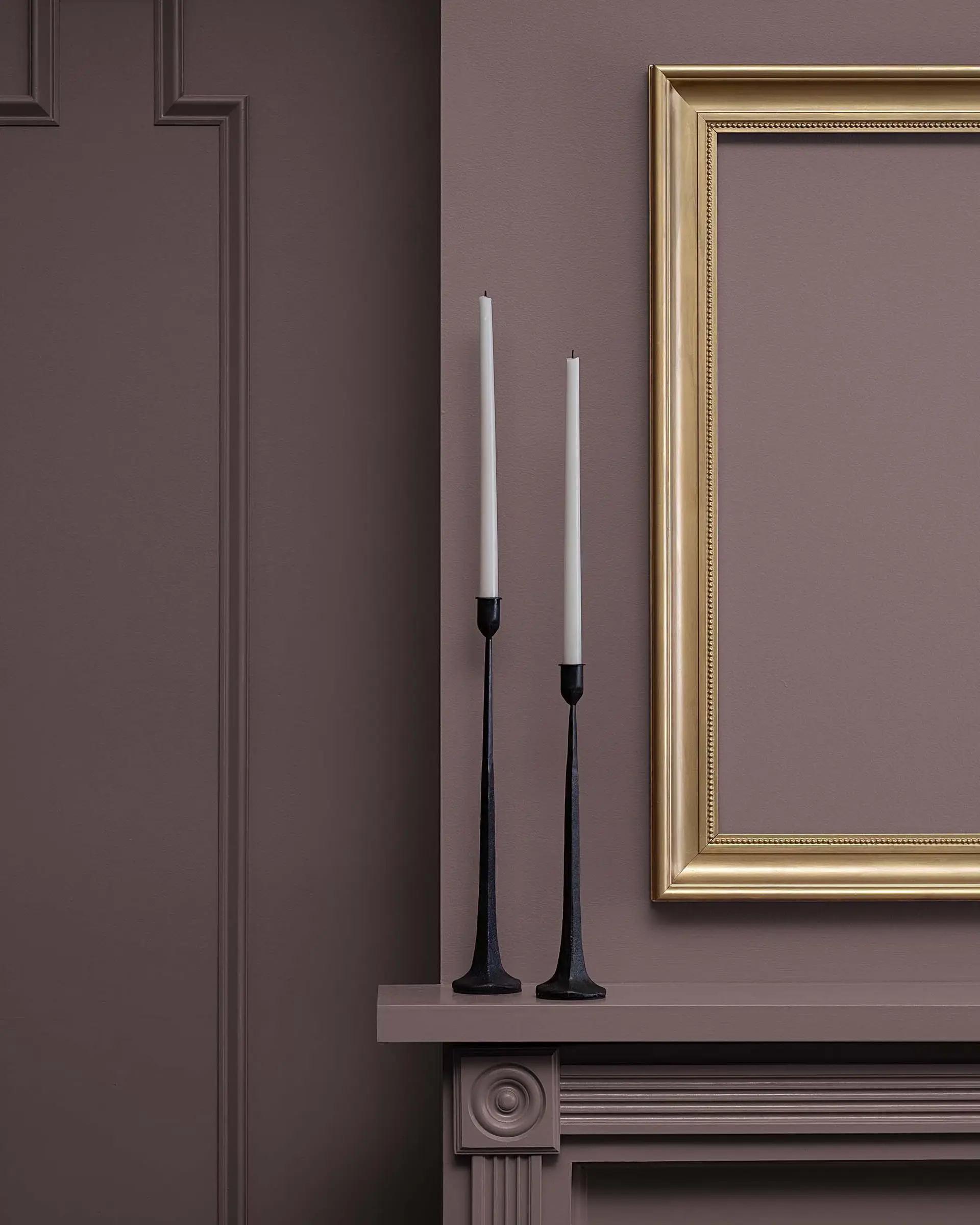
Benjamin Moore calls Cinnamon Slate a mix of heathered plum and velvety brown, which is exactly what makes it so interesting. Depending on the lighting and the colors around it, it can lean brown, mauve, plum or almost taupe.
That complexity is what gives Cinnamon Slate so much richness.
Where would we use it?
This would make an incredible bedroom color, especially paired with natural wood beams, warm flooring, linen, brass or creamy off-whites.
We could also see it in a dining room, library, office or on built-ins.
It creates the kind of room that feels cozy and moody without becoming overwhelmingly dark.
And unlike some very obvious trend colors, Cinnamon Slate doesn't immediately scream a particular year or decorating style.
That's important.
Our verdict: One of Benjamin Moore's strongest recent picks. Warm, sophisticated and surprisingly timeless. We'd use it today without hesitation.
2024: Blue Nova 825
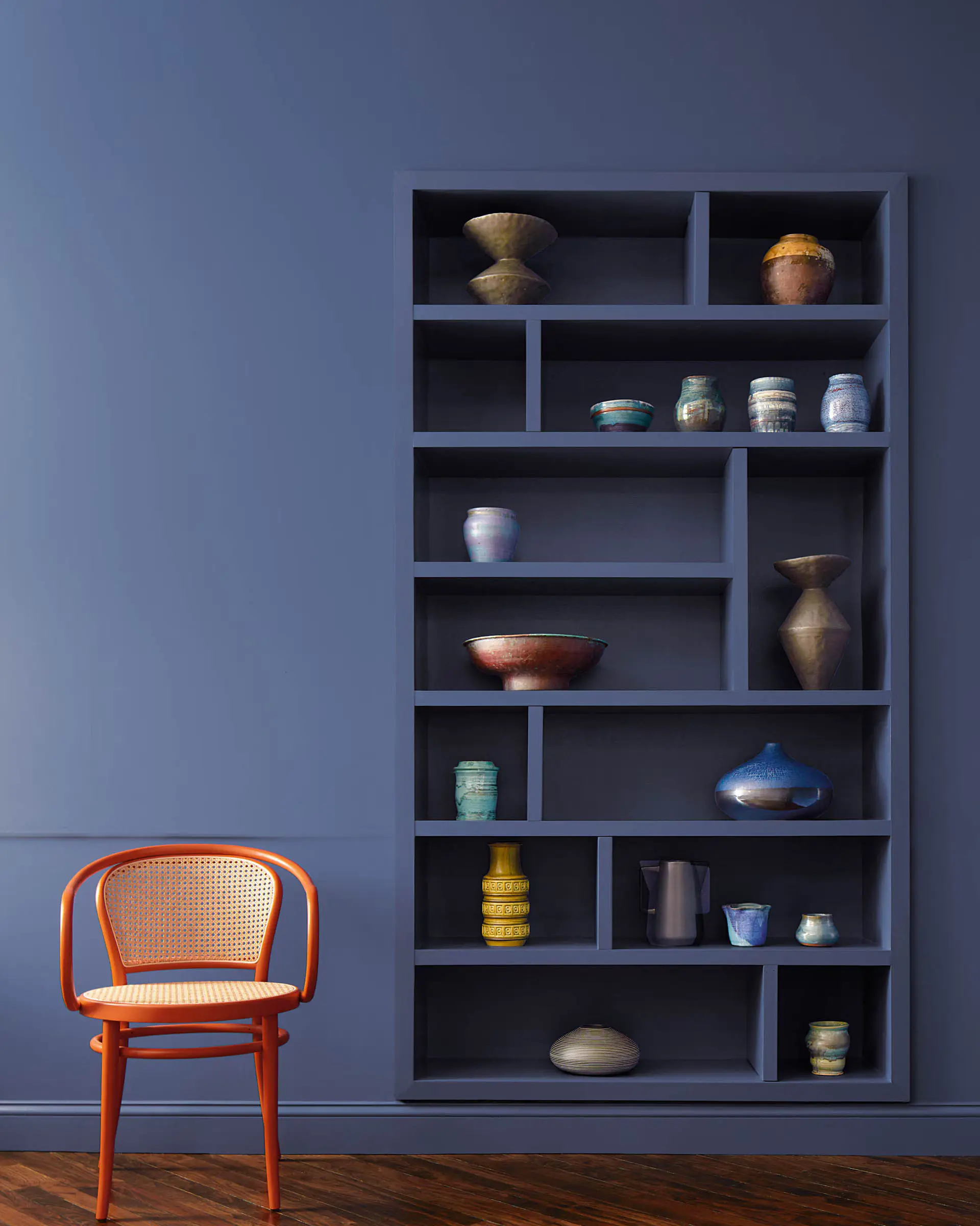
Blue Nova is a deep blue with violet mixed into it, giving it more dimension than a straightforward navy. Benjamin Moore called it an alluring mid-tone with both depth and classic appeal.
To us, Blue Nova feels coastal—but not in a seashells-and-anchor-decor kind of way.
It feels like the richer, more sophisticated version of coastal blue.
And honestly, we don't think blue is ever going to truly go out of style.
Where does Blue Nova work today?
Cabinets.
A kitchen island.
Bathroom vanities.
An office.
Built-ins.
Even an entire room for someone who genuinely loves blue.
For homeowners who have spent the last decade surrounded by white, gray and beige, a rich blue cabinet can add color without making the house suddenly feel wild.
Blue Nova is bold enough to be interesting but familiar enough that most people aren't intimidated by it.
Our verdict: Still works. Blues come and go in popularity, but blue itself is basically a classic. We'd especially use Blue Nova on cabinetry or in a smaller, intentional space.
2023: Raspberry Blush 2008-30
Okay.
Hmmmmmm.
Benjamin Moore went bold in 2023.
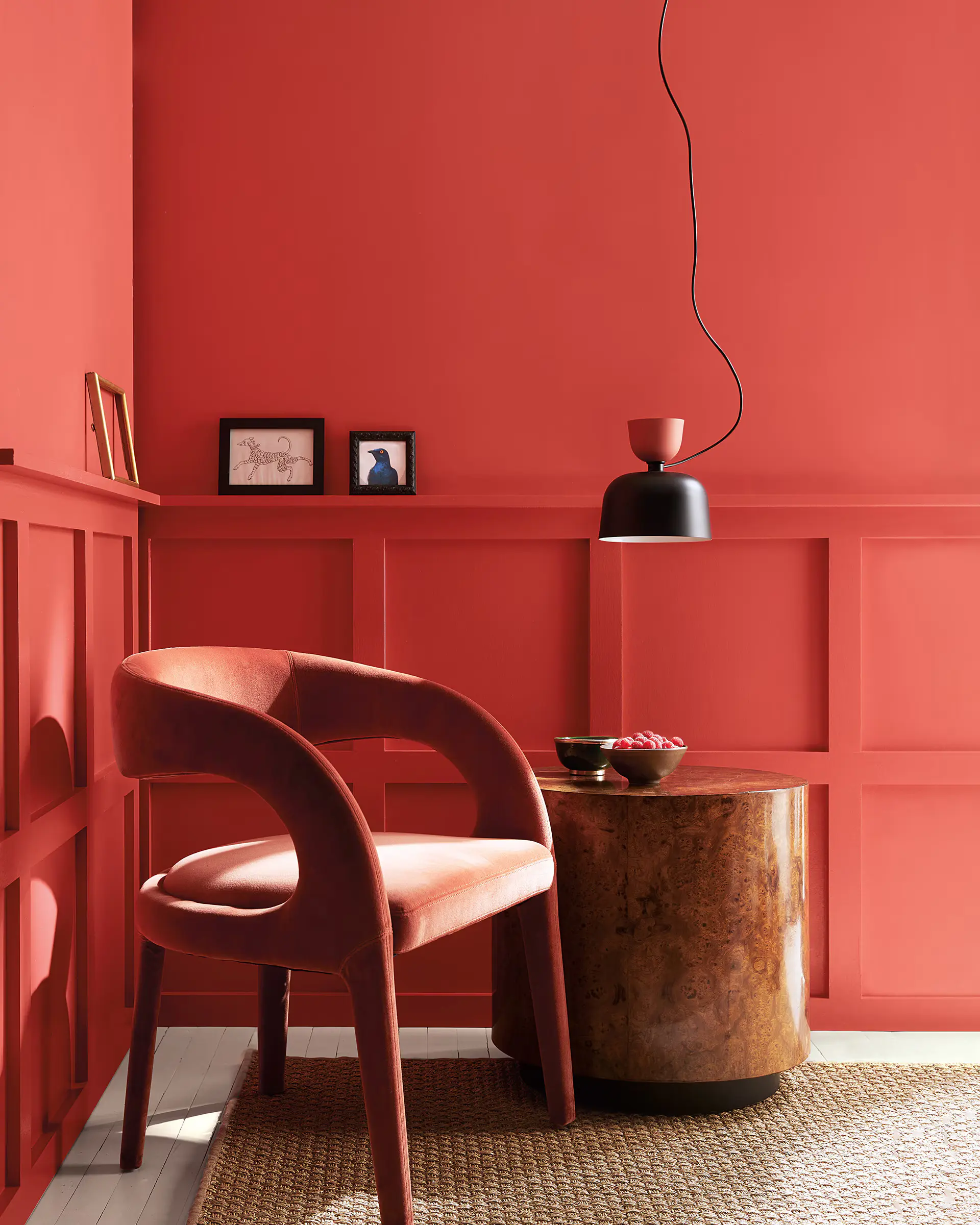
Raspberry Blush is officially described as a saturated coral-red with pink undertones. Benjamin Moore encouraged homeowners to use it on accent walls, powder rooms and even entire color-drenched spaces.
And we understand what they were trying to do.
After years of white, gray and neutral interiors, this was a push toward personality and color.
But...
Would we use Raspberry Blush today?
Probably not.
At least not on walls or cabinetry in our own homes.
There's something about this particular shade that takes us back to the deep reds, burgundies and Tuscan-inspired colors that dominated homes in the early 2000s.
And not everything from the early 2000s needs to come back.
Could Raspberry Blush work beautifully in the right designer's hands? Absolutely. It's dramatic, cheerful and full of personality.
But compared with the other colors on this list, it feels much more tied to a specific attempt to make bold color happen.
Our verdict: Trend. Not timeless.
Sorry, Raspberry Blush.
2022: October Mist 1495
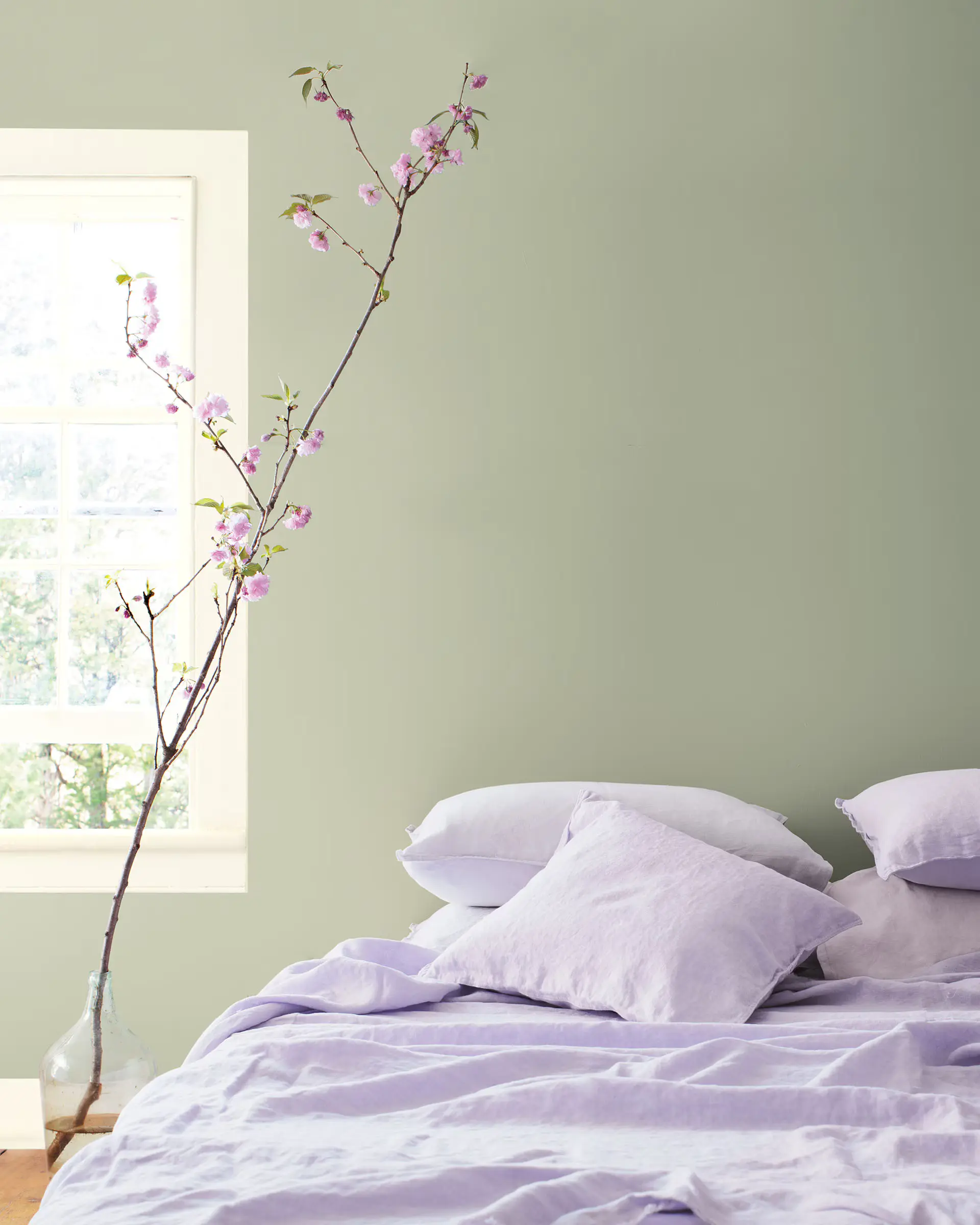
October Mist is a gently muted sage green inspired by the soft green of a flower stem. It's considerably lighter and quieter than several of the colors that came after it.
And our reaction to this one is pretty simple:
It's pretty.
It's safe.
It's soft.
It's... fine.
We don't dislike October Mist at all. In fact, that's probably part of its strength.
Would October Mist still work today?
Definitely.
Sage green is one of those colors that can move pretty easily through different design styles. Put it with natural wood and creamy whites and it feels organic. Pair it with traditional furniture and it feels classic. Use it in a bathroom or bedroom and it feels calm.
We probably wouldn't make it our first choice for an entire house, but it could work beautifully in bedrooms, bathrooms, laundry rooms or even cabinetry.
It isn't a color that feels especially “2022” anymore.
But it also isn't a color that makes us stop scrolling and say, We NEED that.
Our verdict: Timeless enough to survive trends. Very usable. Very safe. Just not the most exciting Color of the Year Benjamin Moore has ever chosen.
2021: Aegean Teal 2136-40
This may be the sleeper hit of the group.
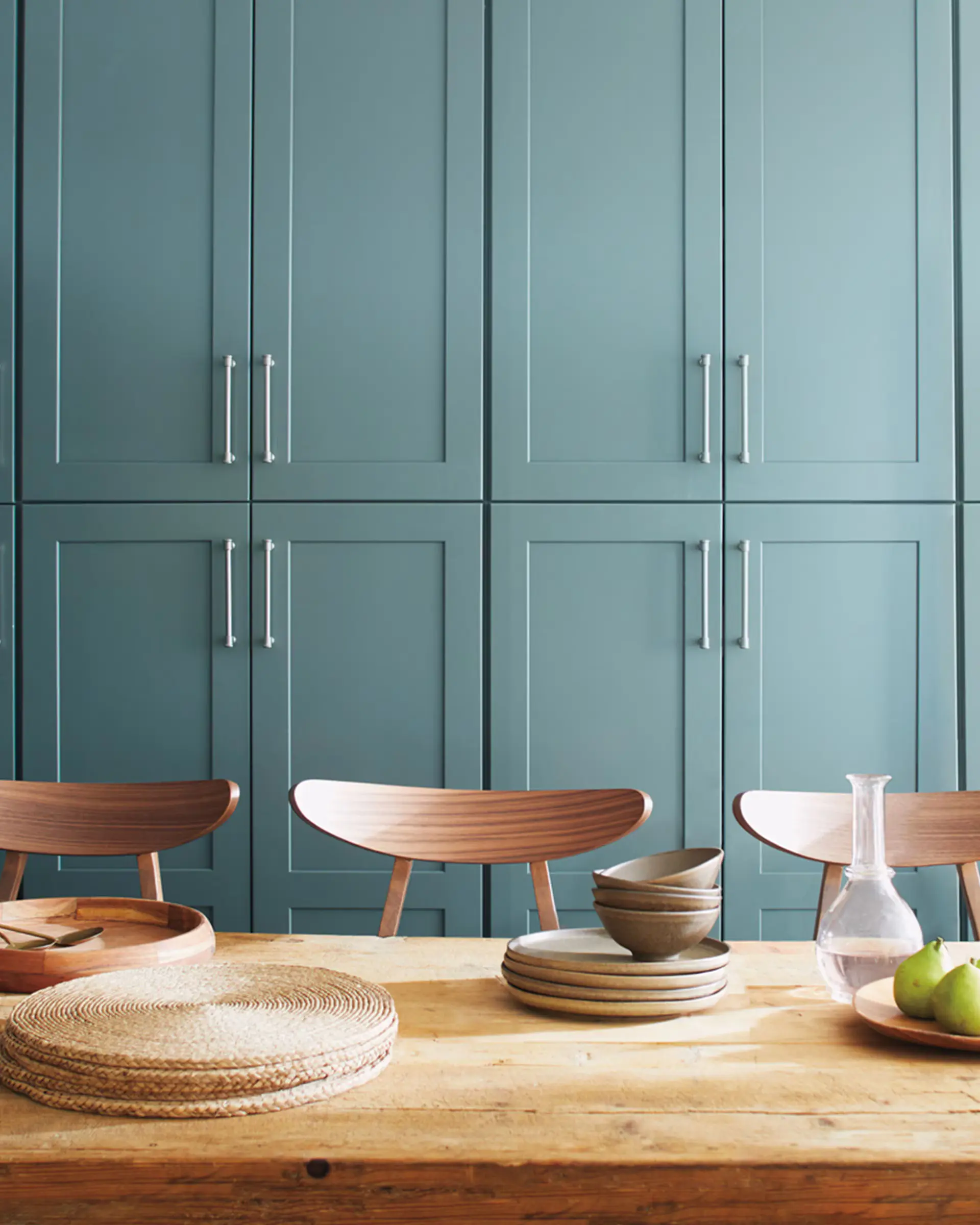
Aegean Teal is a blue-green with a touch of gray, and Benjamin Moore describes it as a balanced mid-tone intended to create a sense of natural harmony.
Looking at a small paint swatch, it can seem surprisingly colorful.
But put it across an entire room and something happens.
It becomes softer.
Deeper.
More sophisticated.
Instead of screaming “TEAL!” it settles into this beautifully muted blue-green that feels rich without becoming overwhelming.
Benjamin Moore even featured Aegean Teal on a kitchen island when the color launched, and we still think cabinetry is one of its strongest uses.
Would we use it today?
Definitely.
We'd use Aegean Teal on cabinets, built-ins, a bathroom vanity or for a fully color-drenched office or bedroom.
For someone who is officially exhausted by beige but isn't ready to paint their walls bright blue, this is a really good middle ground.
Our verdict: Still beautiful. Still sophisticated. And honestly, we may like it more now than we did when it was announced.
2020: First Light 2102-70
And finally, we're going all the way back to 2020.
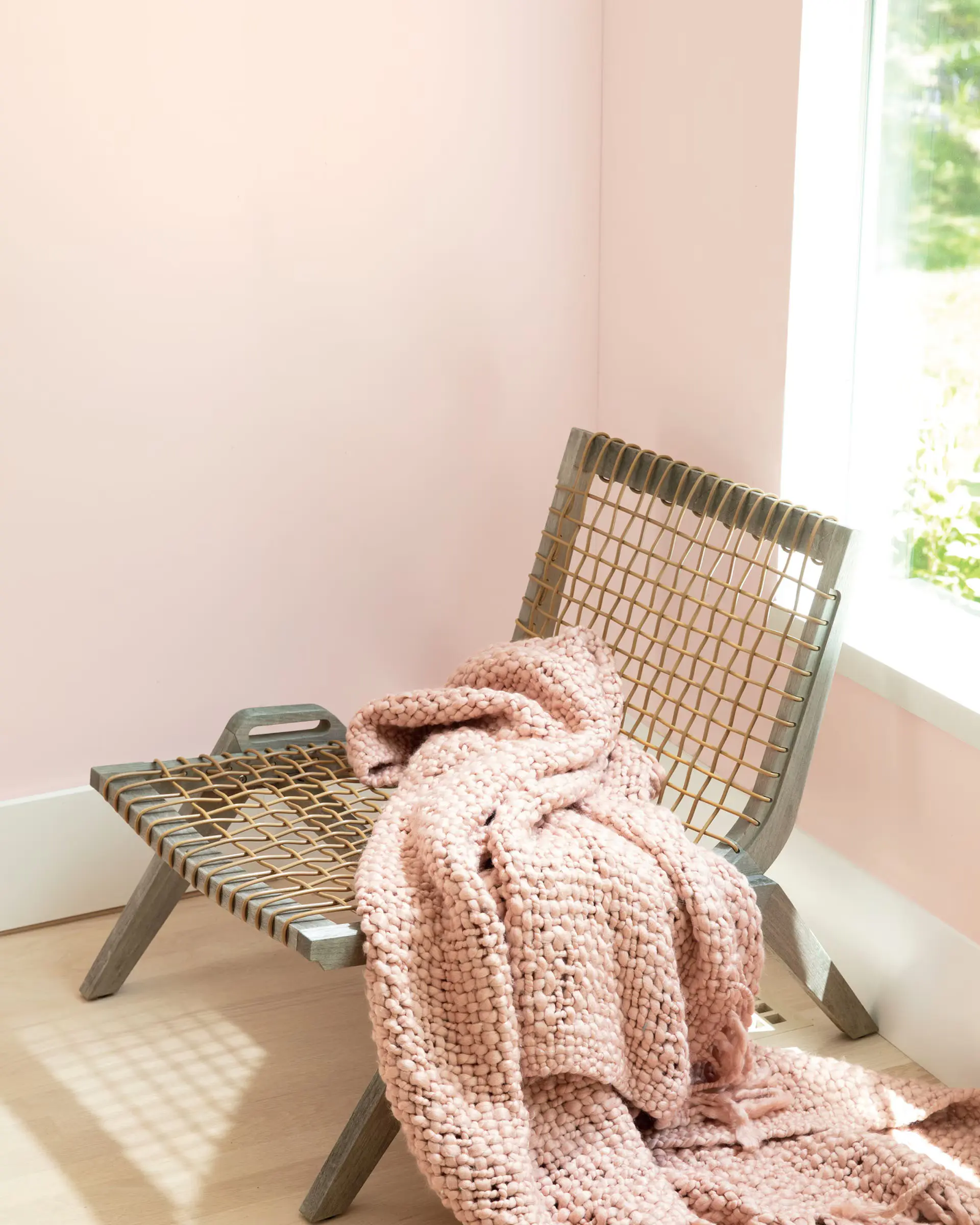
Benjamin Moore chose First Light, an incredibly soft, airy pink that they positioned as an alternative to traditional white or beige.
Seven years later, does it still work?
Yes—but we think it has a pretty specific home.
Where would we use First Light?
Give us a little girl's bedroom.
Seriously.
It's almost perfect.
It's warm without becoming bubblegum pink. It's soft enough that you can still build a beautiful room around it, and it works with creams, warm whites, natural woods and plenty of other colors.
We wouldn't call pale pink a major 2026 trend.
But that's actually part of the point.
Some colors don't need to trend.
Soft pink bedrooms existed long before Benjamin Moore named First Light Color of the Year, and they'll exist long after.
Our verdict: Not really trending—and that's okay. It's a classic soft pink that we'd still happily use in the right space.
So Which Benjamin Moore Colors Aged the Best?
Looking back at all seven tells us something interesting about paint trends.
The colors that age best usually aren't the colors trying the hardest to be trendy.
They're the complicated colors.
The slightly muddy blues.
The sage greens.
The warm browns.
The colors with enough undertones that they change throughout the day and work with different woods, flooring, fabrics and finishes.
That's probably why Cinnamon Slate, Aegean Teal and Silhouette are some of our favorites from this group.
And then there are colors like Raspberry Blush.
We appreciate you.
We're just not painting our cabinets with you.
Now We're Waiting for Benjamin Moore's 2027 Color of the Year...
So what do we think is coming next?
We're already seeing paint companies lean heavily toward warmer, earthier colors for 2027, so we're very curious to see whether Benjamin Moore follows that direction—or throws everyone a curveball.
Either way, we'll be breaking it down as soon as it's released.
And if looking through seven years of paint colors suddenly has you staring at your own walls thinking, Maybe it's finally time...
The timing is pretty good.
Save on Your Interior Painting Project This Winter
This winter, Northwest Specialty Painting is offering $200 off every $1,000 on interior painting projects of $5,000 or more—with no cap.
That means a $7,000 interior project costs $5,600.
You can combine rooms, walls, ceilings, trim and even kitchen cabinets to reach your project total.
And if choosing the color is the thing that's stopping you, we'll help with that too. Your estimate includes free color help and free color samples, so you don't have to figure it all out on your own.
Request your free estimate by November 15, get your written estimate and decide whether you want to move forward. If you do, we'll schedule your project during our open winter dates from November through March.
And just like always:
You pay nothing until the job is done.
Your project is backed by our 5-year workmanship warranty.
And if you don't love it, we'll repaint it free.
Maybe Cinnamon Slate has been sitting on your Pinterest board for a year.
Maybe you've been wanting blue cabinets.
Maybe this is finally the winter you ditch the builder beige.
Whatever color you're considering, we'd love to help you bring it to life.


