
Sherwin-Williams 2027 Color of the Year: How to Use Celery in Your Home
Sherwin-Williams’ 2027 Color of the Year: How to Use Celery in Your Home
If you’ve been waiting for an excuse to bring a little more color into your home, Sherwin-Williams just gave you one.
Their 2027 Color of the Year is Celery SW 6421, a fresh, herbal green that feels cheerful, organic and just a little unexpected. Sherwin-Williams describes Celery as an airy green with subtle yellow undertones, landing somewhere between a soft pastel and a more grounded botanical shade.
And while Celery is definitely bolder than the whites, beiges and soft greiges we’ve seen dominate interiors for the last several years, that doesn’t mean you need to paint your entire house green.
In fact, we think this is the kind of color that can be really fun when it’s used intentionally.
Here are a few ways we’d use Celery in a home—and some beautiful Sherwin-Williams colors you can pair with it to create a cohesive whole-home paint palette.
1. Liven Up a Kid’s Room With Celery
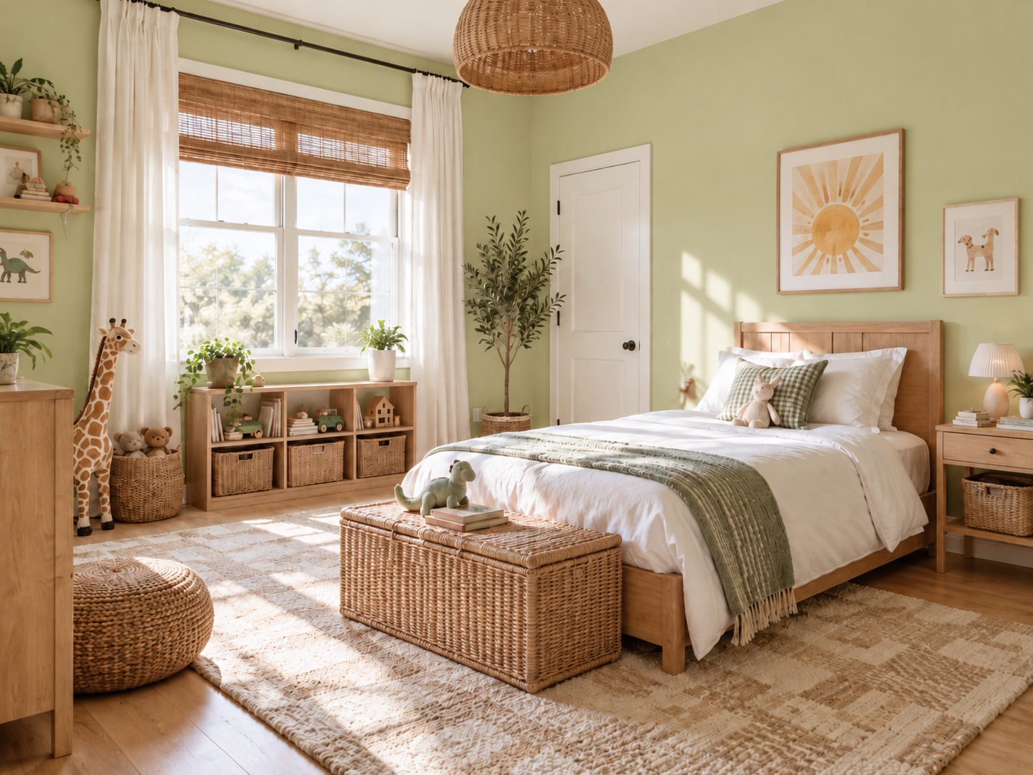
A kid’s bedroom is one of the best places in your home to have a little more fun with color.
Celery SW 6421 feels playful without being overly juvenile, which means it can grow with the room as your child gets older.
You could use it on all four walls for a bright, cheerful bedroom, paint one feature wall behind the bed, or even use it on built-ins or a reading nook.
Pair it with natural wood, warm white bedding, woven textures or fun pops of blue, pink, orange or navy, and suddenly the room has personality without feeling chaotic.
It’s also a great reminder that kids’ rooms don’t always have to default to traditional baby blue, blush pink or gray. A fresh green can create a space that feels colorful, happy and full of life.
2. Make a Small Guest Bathroom More Interesting
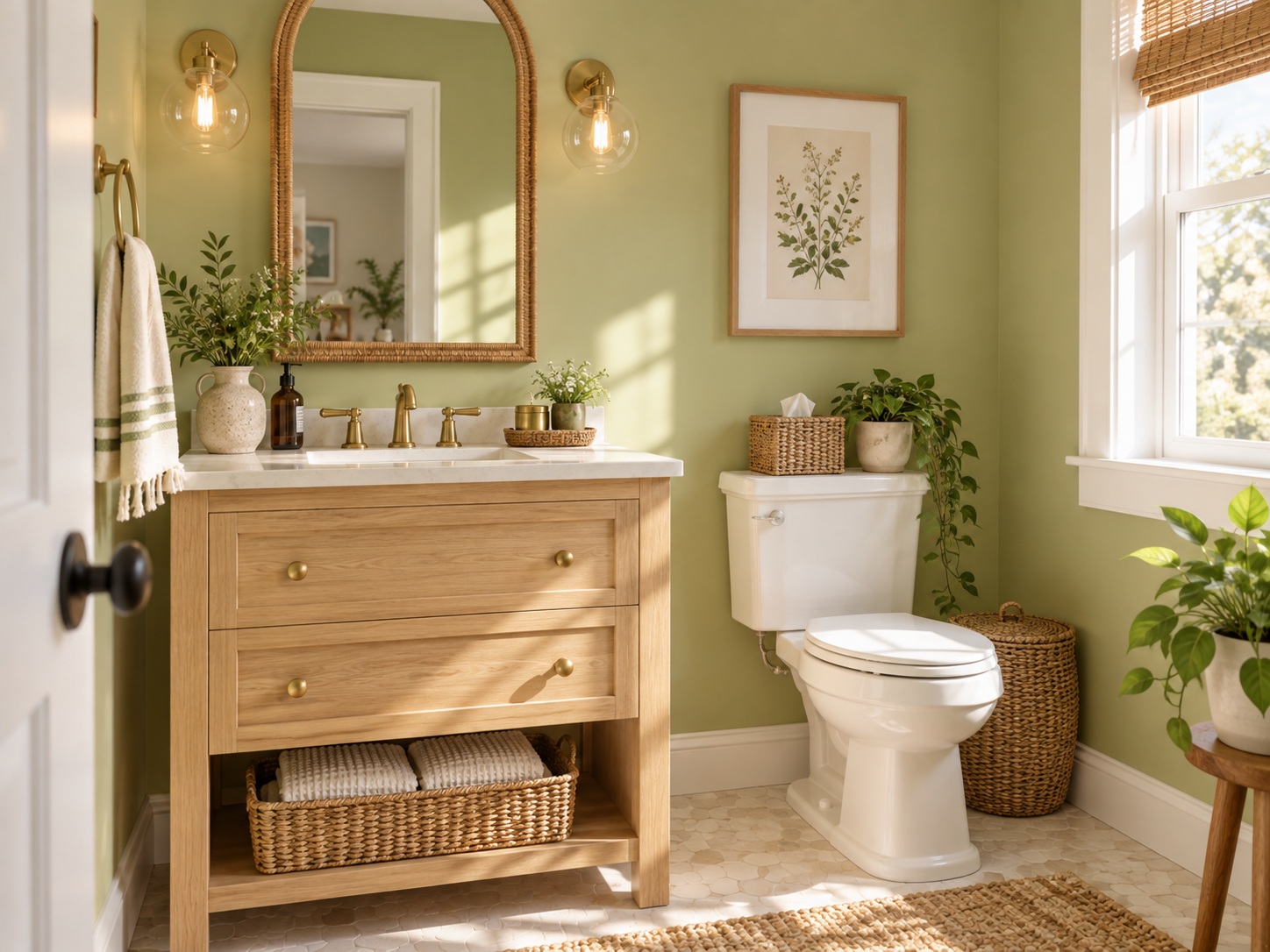
Want to try a bolder color without committing to a large space?
Start with the guest bathroom.
Powder rooms and smaller bathrooms are some of our favorite places to experiment with paint because they’re contained spaces where you can do something a little unexpected.
Imagine Celery on the walls with crisp white trim, a pretty wood vanity, brass hardware and a statement mirror.
Or go a step further and use Celery above wall molding with a complementary color or warm white below it.
Bathrooms are also an easy place to bring in patterned tile, artwork and accessories that can tie the green into the rest of your home.
Instead of treating a small bathroom like a space that needs to disappear, let it become one of the rooms people remember.
3. Use Celery as an Accent Wall
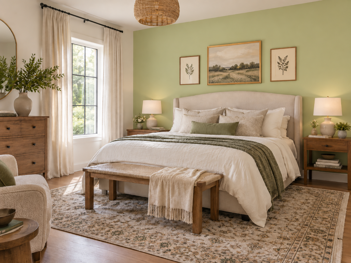
If four green walls feel like too much, there’s nothing wrong with using Celery in a smaller dose.
A single accent wall can completely change the feeling of a room.
Think:
Behind the bed in a guest room
Around a fireplace
In a home office
Behind open shelving
In a breakfast nook
At the end of a hallway
Inside a mudroom or entryway
The key with a color like Celery is giving it a purpose.
Instead of randomly choosing one wall, use the color to highlight an architectural feature or create a focal point.
That gives you the personality of a bolder paint color while keeping the rest of the room neutral.
Building a Whole-Home Color Palette Around Celery
One of the biggest mistakes homeowners make when choosing paint colors is looking at each room completely independently.
Your rooms don’t have to match, but they should feel like they belong in the same house.
That’s why we love creating a whole-home paint palette before starting a larger interior project.
Celery can absolutely be part of that palette without becoming the color you see everywhere.
Here are three Sherwin-Williams colors we think would work beautifully alongside it.
White Flour SW 7102: Your Warm Neutral
If you want Celery to be the fun part of your color palette, White Flour SW 7102 gives you a beautiful neutral foundation.
Sherwin-Williams describes White Flour as a clean white with a subtle creamy warmth.
We could see White Flour working beautifully in:
Main living areas
Hallways
Entryways
Trim
Bedrooms
Open-concept spaces
Then Celery becomes the unexpected moment of color that makes the home feel more custom.
Instead of every room being the exact same neutral, you have continuity with intentional moments of personality.

Artichoke SW 6179: Beautiful Green Cabinets
If you love green but want something richer and more grounded for cabinetry, take a look at Artichoke SW 6179.
Imagine a home with White Flour walls throughout the main living spaces, Celery making an appearance in a kid’s room or powder bath, and Artichoke cabinets in the kitchen or bathroom.
That combination gives you layers of green without making the house feel like everything is the same color.
Artichoke could be especially beautiful on:
Kitchen cabinets
A large kitchen island
Bathroom vanities
Mudroom cabinetry
Built-ins
Laundry room cabinets
Pair those greens with warm wood flooring, natural stone and aged brass or black hardware, and you’ve got a color palette that feels earthy, warm and updated.
Cocoon SW 6173: Add a Moody Brown
Not every color in the palette needs to be light.
Adding a darker, moodier shade like Cocoon SW 6173 can give the home some depth and keep a brighter shade like Celery from feeling too sweet.
Cocoon is the kind of color we’d consider for a home office, den, bedroom, dining room or another space where you want a cozier feeling.
Picture the flow:
White Flour through your main spaces.
Celery for a cheerful pop of color.
Artichoke on cabinetry.
Cocoon in a cozy room where you want a little more drama.
Now you don’t just have four paint colors.
You have a whole-home palette.
Bold Color Doesn’t Have to Mean a Bold Entire House
We meet plenty of homeowners who love color when they see it online but get nervous when it comes time to put it on their own walls.
That’s understandable.
Paint looks different depending on your lighting, flooring, furniture and the other finishes already in your home.
The solution doesn’t have to be going back to beige.
Instead, be strategic about where you use the bold color.
Keep your larger connected areas neutral. Choose one or two rooms where you can have fun. Use deeper coordinating colors on cabinetry or in rooms you want to feel cozy.
When all of those colors are chosen together, your home can feel colorful without feeling busy.
And if Celery isn’t your green? That’s okay too.
The bigger trend we love here is homeowners becoming more comfortable bringing personality back into their interiors.
Thinking About Repainting More Than One Room? Now Is a Great Time.
If seeing the 2027 colors has you looking around your house and thinking it may finally be time for an update, our current interior painting promotion can make a larger project even more worthwhile.
Right now at Northwest Specialty Painting:
Save $1,000 on painting projects of $5,000 or more.
Or...
Save $2,000 on painting projects of $10,000 or more.
That could mean updating several rooms at once, creating a new whole-home color palette, refinishing your cabinets, or finally tackling the interior painting project that’s been sitting on your list.
And you don’t have to figure out all of those colors alone.
We can help you look at how the rooms connect, how the colors work with your existing finishes and where it makes sense to add those bolder moments.
Whether Celery SW 6421 ends up on your walls—or simply inspires you to finally bring a little more color into your home—we’d love to help.


