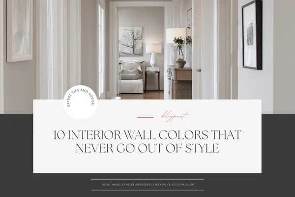
10 Interior Wall Colors That Never Go Out of Style
What Interior Wall Color Never Goes Out of Style?
(NWSP’s Guide to Timeless Paint Colors for Western Treasure Valley Homes)
If you’ve ever stood in a paint aisle staring at 200 shades of “white,” you know choosing the right interior color can feel overwhelming. And when you’re investing in repainting your home, you want a shade that will still look beautiful years from now — not one that starts feeling dated the moment trends shift.
As professional painters serving the Western Treasure Valley (Ontario, OR • Fruitland • Payette • Weiser • Middleton • Caldwell), we get this question all the time:
“What interior wall color never goes out of style?”
And the good news? There are colors that truly stand the test of time.
But first, here’s what most homeowners get wrong…
The #1 Mistake Homeowners Make When Choosing “Timeless” Paint Colors
Most people assume white = timeless, so they choose the brightest, starkest white on the shelf.
But true, icy whites often make your home feel:
Sterile
Cold
Harsh under natural light
More like a hospital than a cozy, welcoming home
This is why so many NWSP clients come to us saying, “Why does my house feel so flat after painting it white?”
It’s almost always an undertone issue.
The timeless colors that age beautifully are not stark whites — they’re soft, warm neutrals that bring light, comfort, and flexibility to your space.
So… What Colors Actually Never Go Out of Style?
Here are our top timeless interior colors — the same ones color experts recommend and that we install in homes across the Treasure Valley every week.
These shades work in nearly every style of home, from modern to farmhouse to traditional, and they adapt beautifully to changing décor over the years.
Timeless Color Ideas to Consider for Your Home
1. Farrow & Ball — Hague Blue

A deep, rich navy with just a touch of teal.
Works great in offices, moody bedrooms, and cabinets
Adds sophistication without feeling trendy
Perfect for homeowners who want color without committing to something loud
2. Farrow & Ball — Railings

A soft, versatile off-black.
Not as harsh as true black
Perfect for doors, railings, trim accents, cabinets
A long-term classic that never looks outdated
3. Behr — Swiss Coffee

One of the most beloved warm whites on the market.
Soft, creamy, inviting
Adds warmth without looking yellow on the wall
A favorite for whole-home palettes in open floor plans
4. Behr — Blank Canvas

Behr’s Color of the Year — and for good reason.
Clean, naturally balanced white
A “blank slate” for décor flexibility
Great for homeowners who want something bright, but not icy
5. Sherwin-Williams — Alabaster (SW 7008)

The industry’s most talked-about warm white.
Soft, balanced, gentle warmth
Works for walls and trim
A perfect whole-home color for open concept spaces
Doesn’t look stark under bright sunlight
6. Sherwin-Williams — Snowbound (SW 7004)

A slightly taupe-leaning neutral white.
Fantastic alongside browns, beiges, or warm flooring
Pairs well with earthy finishes that are common in Western Treasure Valley homes
7. Sherwin-Williams — Agreeable Gray (SW 7029)

The ultimate “greige.”
Bridges warm and cool tones
Pairs with almost anything
Not too dark, not too light
Holds up in almost every design trend
8. Benjamin Moore — Balboa Mist (OC-27)

A soft, refined gray-beige.
Light enough for whole-home use
Gentle, modern, and endlessly versatile
Works beautifully with wood tones and warm accents
9. Benjamin Moore — Classic Gray (OC-23)

One of the best “glue colors” ever created.
Soft, barely-there gray
Warm, inviting, and ultra adaptable
Great for homeowners who want subtle color without going beige
10. Benjamin Moore — Chantilly Lace (OC-65)

The cleanest, brightest white in their catalog.
Perfect when you need a true white
Ideal for trim, ceilings, and crisp accents
Works beautifully with any color palette
Why These Colors Are Timeless
Every one of these shades shares three qualities:
1. They avoid harsh primary undertones (red, yellow, blue).
Those colors date quickly and often age badly on walls.
2. They make a home feel warm, calm, and inviting.
Susan (our ideal homeowner) doesn’t want a museum — she wants a space where family can gather, grandkids can play, and hosting feels comfortable.
3. They work with any décor style.
Farmhouse? Yes.
Minimalist? Yes.
Traditional? Yes.
Mid-Century? Yep.
A timeless color shouldn’t lock you into a design trend — it should support your style as it evolves.
NWSP’s Expert Tip: Harmonize Your Whole-Home Palette
One of the biggest advantages of hiring a professional painter: we create a cohesive palette that flows from room to room, especially in open-concept homes.
Here’s how we typically recommend structuring color:
Main living, kitchen, and dining: Light neutrals such as Alabaster, Snowbound, Balboa Mist, or Blank Canvas
Bedrooms & offices: Slightly richer tones such as Hague Blue or Agreeable Gray
Laundry or mudroom cabinets: Deep colors for character — Railings or Hague Blue are stunning here
Trim & ceilings: Soft whites like Blank Canvas or Chantilly Lace
This creates a home that feels both modern and timeless — not chopped up or mismatched.
Want Your Home Painted in a Timeless Color for 25% Less?
Right now is the smartest time of year to paint your home in a color that will look beautiful for the next decade (or more!).
During NWSP’s Winter Refresh Event, you can get:
25% off all interior painting
25% off cabinets, soft-close hinges, and hardware upgrades
Fast scheduling — most projects start within a week
5-Year Warranty + “Love It or We Repaint It Free” Guarantee
A $9,000 summer interior project becomes just $6,750 in winter — for the exact same high-quality work.
Ready to Transform Your Home With a Color That Never Goes Out of Style?
Click below to schedule your free estimate and lock in Winter savings before spots fill up:
👉 Schedule Your Free Estimate
(We’ll help you pick the perfect timeless color, too.)
